 Porch Ceilings
La Fonda Teal, National Trust for Historic Preservation Collection, Valspar
“Although the tradition has long been associated with Gullah Geechee ‘haint blue,’ I’ve also been told a blue porch ceiling keeps mud daubers and wasps from nesting. This shade reminds me of my grandmother’s blue eyes.”—Louise Bance, interior designer, Richmond, Virginia
 Painted Floors
Cottage Red E-22, Benjamin Moore
“The color is very close to one inspired by Creole Red, a hue native to Louisiana. Prior to the development of manufactured paint pigments, natural materials were used to produce color. Animal blood, earth, and berries were likely enlisted to produce a shade close to this one.”—Louis J. Aubert, color specialist, New Orleans, Louisiana
 Front Doors
Blue Danube 2062-30, Benjamin Moore
“Painting a front door a bright color is a way of giving a house a stamp of personality and setting the tone for what you might see inside. On a traditional house, this pop of peacock blue livens up a white brick or shingle-style house. I also love to use it to warm up a modern house.”—Barrie Benson, interior designer, Charlotte, North Carolina
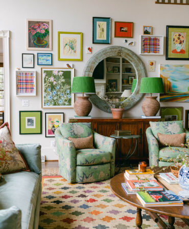
 Libraries
Dutch Chocolate 6012, Fine Paints of Europe
“There is something about a Southern library that calls for a rich tobacco brown. Maybe it’s the association with leather club chairs worn to perfection or tooled book bindings, but this marine-grade lacquer is the perfect color and finish.”—Beth Collier, designer, Washington, North Carolina
 Shutters and Trim
Historic Charleston Green DCR099, Historic Charleston Foundation Collection, Sherwin-Williams
“This interpretation of Charleston green is such a deep and saturated color, it creates a sense of movement and dimension—like a deep pool that you just want to dive into. While legend says a version of this color originated in post–Civil War Charleston, it works throughout the South.”—Jim Strickland, residential designer, Atlanta, Georgia
 Halls and Entries
Rhett Pumpkin DCR021, Historic Charleston Foundation Collection, Sherwin-Williams
“The salmony-pumpkin shade has a vibrant warmth. When paired with crisp white trim, it sets off the architectural details in a room. I have a visceral attachment to this color because it is so similar to the color of the exterior of my grandmother’s house in Thomasville, Georgia.”—Gil Schafer, architect, New York, New York
 Interior Ceilings
Ammonite, Farrow & Ball
“I often choose a room’s ceiling color based on the wall colors of the room, but sometimes it’s nice to tie all of the rooms together through the ceiling color. Farrow & Ball’s Ammonite is a pale, soft gray/white that lends a sense of sophistication and modernity. It reminds me of the gray in the ocean here in Charleston.”—Angie Hranowsky, interior designer, Charleston, South Carolina
 Dining Rooms
Large Dining Room Green MV1, Mount Vernon Estate of Colours, Fine Paints of Europe
“Brilliant, glossy, green verdigris-based paints were used in the late eighteenth century at Mount Vernon in the dining rooms. Verdigris is a copper-based pigment that darkens on exposure to weathering. This paint approximates the color of the hand-ground original.”—Susan Buck, conservator and paint analyst, Williamsburg, Virginia