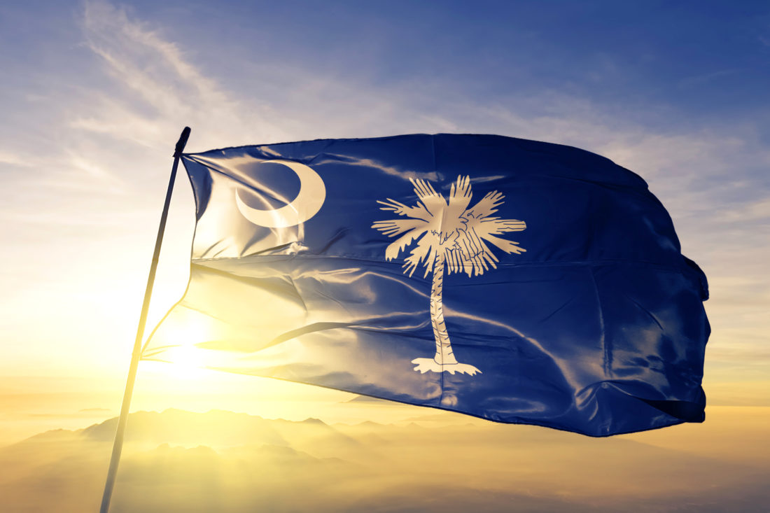
The making and flying of flags occupies as hard-fought a social battlefield as the actual battlefields upon which many flags are flown. So, here’s a bracing argument-starter: South Carolina’s is the most beautiful state flag in the nation, bar none.
Ahoy out there, non-South Carolinians! Please drop some bourbon in a glass, settle back on the couch, and know that that joust was only meant to emphasize two of the more combustible human qualities that we put into flags: first, a sense of identity, and second, that somewhat thornier extension of self, pride. We make flags and fly them to broadcast who we are and how we came to be.
That noted, South Carolina’s elegant crescent-and-palmetto standard does rank in the top tier of this country’s most beautiful state flags, alongside Alaska’s soaring Big Dipper-and-Polaris in the night sky and New Mexico’s zen-like, ancient, Zia pueblo symbol for the sun. The metric is that, as those two flags do, South Carolina’s carries a human narrative well beyond its state lines. The banner presents a bouquet of whom and what it took to make South Carolina, and it delivers that narrative with graphic economy. Literally and metaphorically, it’s a map of place.
All the more reason that the design should be curated with care. On its bumptious, more-than-240-year-long odyssey from Revolutionary War battle flag to the present day, the design changed at several points, and only somewhat stabilized in 1910. The state never trademarked it, though, nor controlled the placement of the silhouettes, the color of the ground, or any other aspect, particularly after Clemson University gave up the sole right to make the flags in 1940. That meant that any manufacturer could, and did, come up with any version that he or she liked, with the result that even the state government infamously flew a handful of differently tweaked iterations over its own buildings.
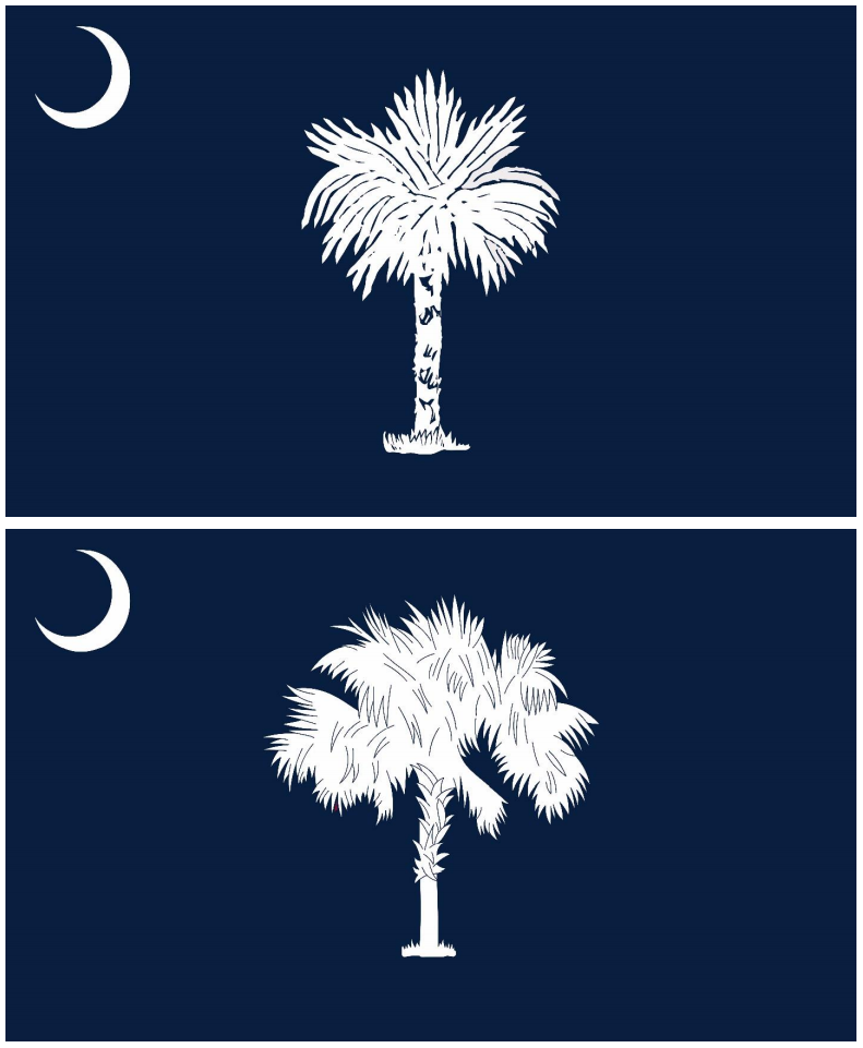
To give the flag a measure of uniformity, in 2018 the legislature mandated the august South Carolina State Flag Study Committee, chaired by Dr. W. Eric Emerson of the Department of Archives and History, to come up with a design that would, at least, unify what was being flown over state officialdom. In March of last year, the Study Committee debuted its proposed design revisions, including a detailed record of its laudably deep historical research buttressing its determinations.
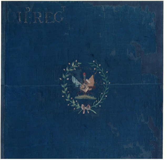
Instantly galvanized, South Carolinians rose more or less as one to condemn the thing. Opinions ran to 90 percent negative, according to the beleaguered Study Committee. Nobody had a problem with the impeccably researched background shade of indigo, selected from a Revolutionary War flag used by South Carolina’s 2nd Regiment, one that had been captured by the British, no less. Nobody had a problem with the crescent, which had been on the flag since it was first flown as a purely regimental banner in the mid-eighteenth century. The ire was instead directed at the Committee’s silhouette of the sabal palmetto.
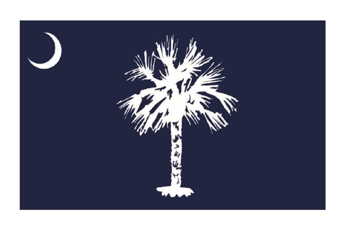
Put diplomatically, South Carolinians read the sabal silhouette as ragged and unkempt. The question was not whether the tree had been neglected and was about to die; the question was why the Committee would think that a dead palmetto belonged on the flag. Actually, the silhouette was a more impressionistic, positive image than that, based on a 1910 illustration that had informed that era’s re-design of the flag. The twenty-first-century interpretation of the sabal fronds did bear a sort of jaunty spareness, not dissimilar from a Matisse cut-out, but, chastened by the public, the Study Committee promptly retired back to the drawing board. Since then, they have presented the legislature with two new versions from which to choose.
To say that the palmetto is a beloved symbol of South Carolina is the heaviest of understatements. With its spiky, almost cartoonish biomass, the subtropical Southern seaboard tree is at least halfway sanctified, if not an outright holy icon. Ironically, the flag itself has helped icon-ize the tree for the 160 years that the palmetto has been part of the imagery. Despite the Italian diminution -etto, the sabal makes a grand landscape ornament, with mature examples reaching sixty to seventy feet.
Before the legislature votes, then, it’s useful preparation to walk through the flag’s origins, beginning with the oldest symbol that has been identified with South Carolina since the French and Indian War, the crescent.
The crescent hadn’t made it onto the battle flag quite yet in 1760, as Colonel Thomas Middleton formed his South Carolina Provincial Regiment to fight alongside British regulars against the Cherokee. William Moultrie was a captain in Middleton’s regiment, Francis Marion, a lieutenant. As their fellow officers did, Moultrie and Marion wore silver gorgets around their necks—gorgets being the crescent-shaped piece of medieval throat armor that, by the late eighteenth century, had become ceremonial military dress, taking the form of a choker, worn points-up on a neck chain. The South Carolina infantrymen adopted the symbol as their cap badge.
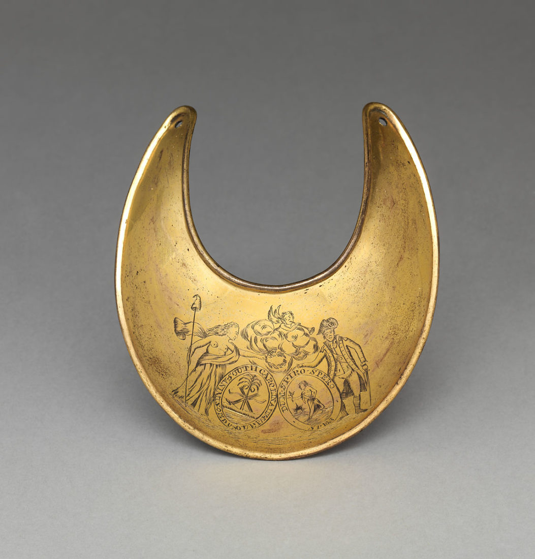
A short generation on, Moultrie and Marion were famously raising very different regiments to fight against the British. Marion wore the gorget emblem on his helmet. Moultrie’s 2nd South Carolina Regiment had the gorget on their drums and on their uniforms as a badge. An image of one those drums bearing the gorget emblem was embroidered on the indigo silk regimental flag that Moultrie’s boys carried into battle against the British at the Siege of Savannah—thought by the Study Committee to have been the first time the “crescent” actually appeared on a South Carolina flag.
That flag was captured in the battle by the British and taken as a war trophy back to England by Savannah’s commanding British officer, whose family held it for a couple of centuries—which had the piquant effect of preserving the thing, until the Smithsonian could finally persuade them to part with that fine chunk of Americana. It’s from this original, captured 2nd Regiment flag that the Study Committee also took the precise shade of indigo for their revised design—Pantone 282 C—the original having been sumptuously dyed in the local elixir.
It took eighty-five years for the palmetto to work its way onto the flag. Though long gone, the hero Moultrie had agency even in adding the tree. Because: In his famous 1776 defense of Sullivan’s Island, staving off the British occupation of Charleston, Moultrie’s success was secured by his having ordered the fort built out of resilient palmetto logs, which gave when hit by British shot, causing the cannonballs simply to bounce off.
The first rendering of what we might call Moultrie’s Palmetto, applied to the flag in 1861, was a juicily fat juvenile, with what the botanists call boots, or the bases of fallen palm fronds, serried along the trunk. In other words, an untended but quite jolly tree.
Sabals lose their boots as they get older and taller, but the point of South Carolinians’ twenty-first-century argument with the Flag Study Committee was about the fronds. In the first proposed post-secession design back in 1861, the tree’s silhouette was green, and the fronds reached up to the sky. That was immediately followed with a draft upon which the palmetto silhouette was in gold, now known as the “2-Day flag,” as that version lasted all of two days. Finally, the lawmakers settled on the fronds emerging from the crown of the tree in a sort of ball, some reaching up and some down, as on an untrimmed tree in nature. South Carolina lived with this version until its first slightly jaunty “modern” redesign in 1910.
The point is that the palmetto has never had just one form. It’s the image whose silhouette has been most changed and most under debate since the flag as we know it came to be. However imperfect the flag may be judged to be now, it is and has long been a splendidly successful piece of public art-by-great-happenstance.
Moultrie’s palmetto logs were its inspiration, but it is a live tree that was brought to the flag, and that infuses the flag with the deep, living Lowcountry landscape. This is at the heart of the flag’s massive crossover appeal: The tree brings us to a place, at once lyrical and inviting. In fact, the sabal so strongly implies “landscape” that it’s why Moultrie’s gorget is often mistaken, mainly by non–South Carolinians, as the moon.
Taking a cue from our best art conservators, in matters of restoration, less is always more. Old things can be dusted or buttressed but shouldn’t be made to look too “modern,” as the “modernized” sabal fronds of last spring’s proposed flag plainly demonstrate.
With such a fine overall design at stake—one of the few that cuts right to the South’s actors in the founding of the nation—it will matter what the legislature decides and what South Carolinians say as that happens. The mantra is: In the moment of determining what will be, it’s crucial to know what was.